
Beautiful fonts
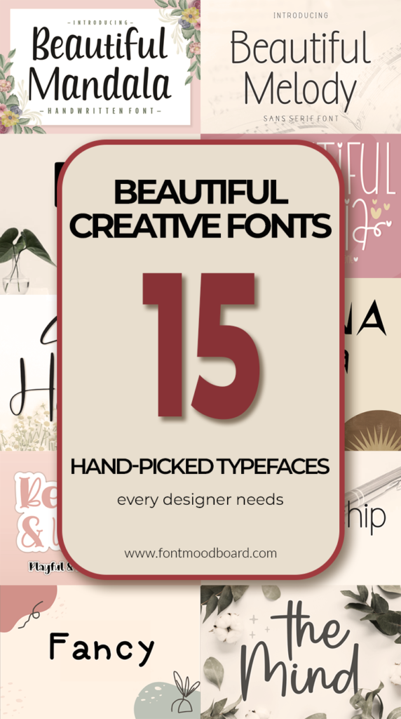
Beautiful creative fonts: 15 hand-picked typefaces every designer needs
In the world of design, typography is the voice of your visual message. As a graphic designer, I’ve learned that selecting the right typeface is about more than just legibility; it’s about evoking emotion and building a unique identity. That’s why I am constantly on the hunt for beautiful fonts that tell a story.
In this post, I want to dive into the magic of Creative Fonts – those unique, handcrafted, and artistic typefaces that break the mold. Whether you are working on a branding project, a wedding invitation, or a striking social media post, stepping away from standard sans-serifs can transform your work from ordinary to unforgettable.
Let’s explore the world of lettering where art meets communication.
Beautiful Creative Font
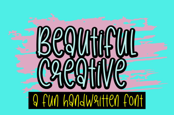
When I stumbled upon the Beautiful Creative font, it immediately felt like finding that perfect sketching pen that just gets your hand. It is fun, quirky, and intentionally asymmetrical – which is exactly why it works so well. In an era where everything looks overly polished and automated, this typeface brings back the human touch.
The uneven baseline and playful letterforms add a layer of authenticity that makes your designs feel alive rather than manufactured. I have been testing it on mood boards and packaging mockups, and it genuinely shines across both digital and print mediums.
If you want your next project to stand out with character instead of blending in with perfection, grab this font today and let your creativity run wild.
Penmanship Font
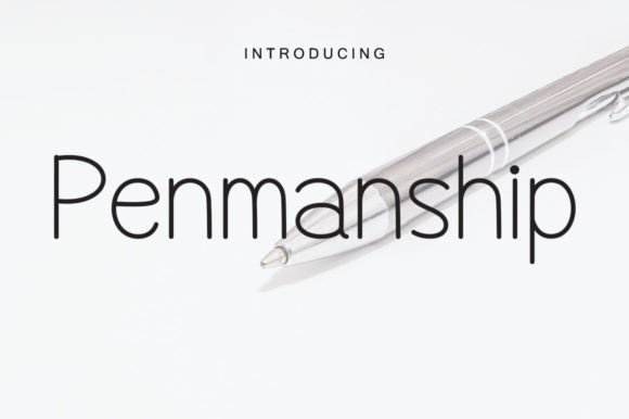
There is something almost meditative about a truly well-crafted cursive font, and Penmanship captures that feeling perfectly. This is not just another script – it has a gentle sophistication that feels personal, like receiving a handwritten letter in a world of text messages. The way the letters flow into one another creates a rhythm that naturally draws the eye, making it ideal for projects that need an emotional core.
I have been imagining this for Save the Dates, boutique branding, or even poetic social media captions where the words need to feel as beautiful as the message itself. It brings that luminous charm we often chase but rarely find in digital type.
If you are looking to add a layer of romance and grace to your next project, I highly recommend giving Penmanship a try.
Fancy Font
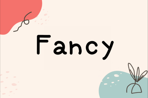
Sometimes you need a typeface that feels approachable rather than intimidating, and that is exactly where Fancy Font shines. This handwritten gem has this effortless warmth that makes it feel right at home across so many different contexts – whether you are working on classroom materials, nature-inspired packaging, or heartfelt personal projects.
I appreciate how the letterforms carry a sense of sincerity without trying too hard to impress. It is the kind of font that connects with people because it feels genuinely human. Lately I have been testing it on mood boards for organic product branding and even some simple save-the-date concepts, and it consistently delivers that authentic, handmade quality.
If you are working on something that needs to feel real and emotionally grounded, do yourself a favor and bring Fancy Font into your toolkit.
Balister Font
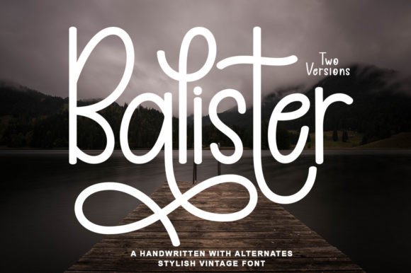
There is a sweet spot where professionalism meets personality, and Balister lives right there. This is not one of those handwritten fonts that forces you to choose between looking credible or looking creative – it gives you both. The strokes have this intentional elegance that feels modern without chasing trends, which is exactly what you want when designing for clients who need to impress.
I have been experimenting with Balister for branding applications, and it holds its weight beautifully across both formal touchpoints like letterheads and more expressive spaces like social media banners. It brings that quiet luxury to packaging and collateral without screaming for attention.
If you have a project that needs to feel polished yet genuinely human, Balister is worth keeping close.
Frenky Missa Font

Every now and then, a font crosses my desk that feels less like a tool and more like an experience, and Frenky Missa is exactly that. This script carries a confident elegance that works whether you are designing a formal invitation or something with a bit more edge.
What draws me in is how the strokes feel both intentional and organic – like calligraphy that refused to be stiff. I have been testing it on invitation concepts and even some editorial layouts, and it adapts effortlessly because the personality is strong without being overwhelming. It brings that professional polish while keeping the human warmth intact.
Go ahead and let Frenky Missa bring that refined yet expressive energy to your next project.
Beautiful Maria Font

There is a distinct charm to a font that feels delicate without being fragile, and Beautiful Maria captures that balance effortlessly. Those tall, thin letterforms create such an elegant rhythm on the page – they almost dance across the baseline. I have been testing this one on wedding concept work and some editorial headers, and it brings this lovely lightness that heavier scripts just cannot replicate.
It is the kind of typeface that makes Valentine’s cards feel genuinely heartfelt or magazine layouts feel thoughtfully curated. What I appreciate most is how it maintains readability while delivering that handwritten softness.
Add Beautiful Maria to your collection and let those delicate letterforms bring something special to your next project.
Digital Signature Font
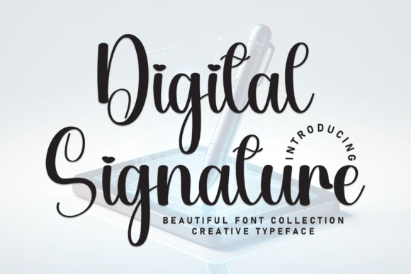
Typography rarely stops me in my tracks, but Digital Signature did exactly that the first time I opened it. This is not just calligraphy – it is calligraphy with an opinion. Those sweeping curves carry this confident, artisanal energy that feels like it belongs on a luxury storefront or a photographer’s watermark.
And then you notice the details: tiny heart-shaped accents hidden in the loops of letters like ‘i’ and ‘g’. It is subtle enough to feel special without crossing into kitschy territory. I have been envisioning this for high-end branding projects and social media content that needs to feel polished but not cold. It brings that fluid elegance while keeping a sense of play alive.
Bring Digital Signature into your next project and let those details do the talking.
Beautiful Mandala Font
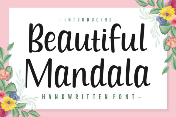
Sometimes the most effective fonts are the ones that know exactly what they are and don’t try to be anything else. Beautiful Mandala is that reliable friend in your type library – simple, elegant, and remarkably versatile. I have been testing it for signature logo concepts and photographer watermarks, and it delivers that understated sophistication that clients always ask for but rarely can articulate.
It carries just enough personality to feel custom without overwhelming the composition. Whether you are working on wedding invitations, apparel branding, or a series of quote cards, this one adapts effortlessly because it does not compete for attention – it simply elevates whatever it touches.
Let Beautiful Mandala bring that quiet elegance to your next project.
Beautiful Melody Font
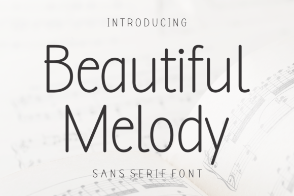
There is something quietly powerful about a sans-serif that refuses to blend in, and Beautiful Melody proves that thin can be mighty. Those elegant, delicate characters carry a refinement that feels almost architectural — clean lines with a soul. I have been experimenting with this one for typographic posters and fine art prints, and it brings this sophisticated breathability that heavier fonts just cannot achieve.
It is the kind of typeface that lets the space around the letters do half the talking. Whether you are designing editorial layouts or minimalist branding that needs to whisper elegance, Beautiful Melody delivers without ever raising its voice.
Let those graceful thin characters bring some breathing room to your next project.
Beautiful Kingdom Font
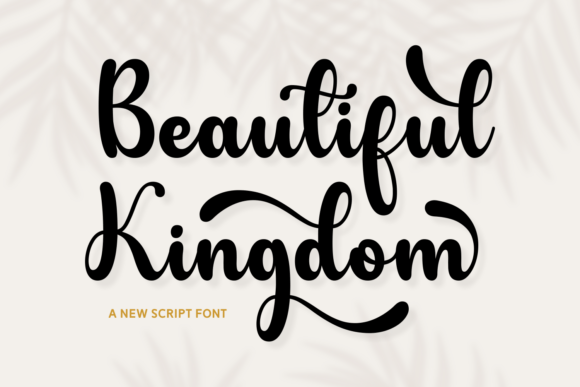
Some scripts are elegant. Some are playful. Beautiful Kingdom somehow manages to be both without breaking a sweat. Those bold strokes carry serious presence, but the decorative swashes keep things feeling fresh and approachable rather than stuffy. I have been testing this one on wedding suite concepts and luxury branding mockups, and it commands attention in all the right ways.
It is the kind of font that makes a logo feel established the moment you drop it in. Whether you are designing for print or digital, those swashes add that little extra moment of delight without overwhelming the composition.
Pull Beautiful Kingdom into your next project and let those bold strokes do the heavy lifting.
Beautiful Moonlight Font
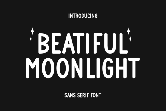
There is a particular pleasure in finding a sans-serif that feels genuinely fresh rather than just another clean slate. Beautiful Moonlight has those smooth curves and gentle lines that make reading effortless without ever feeling boring. It is the kind of typeface that works quietly behind the scenes while making everything look better – like a well-tailored shirt that somehow flatters everyone.
I have been testing it on invitation layouts and poster concepts, and it brings this airy, approachable quality that more rigid fonts just cannot replicate. Whether you are building a brand identity or designing something that needs to communicate clearly with warmth, Beautiful Moonlight delivers without getting in the way.
Let those smooth curves bring some fresh air to your next layout.
Beautiful Unique Font

Some fonts sit perfectly still on the page. Beautiful Unique prefers to move. Those characters genuinely look like they are dancing along the baseline, and that energy is exactly what makes it work. It carries this unfiltered joy that feels impossible to fake – perfect for children’s books, school projects, or honestly anything that needs to stop taking itself so seriously.
I have been testing it on educational materials and playful branding concepts, and it brings this authentic warmth that makes you smile without trying too hard. It is the kind of font that reminds you design can be fun again.
Grab Beautiful Unique and let those letters loose on your next project.
Spring Handmade Font

There is this moment when you find a handwritten font that actually looks like someone held a pen to paper, and Spring Handmade delivers exactly that. The letterforms carry this organic imperfection that makes everything feel immediate and real – like it was made just for that project.
I have been testing it across packaging concepts and social media templates, and it adapts surprisingly well whether you are working big on a poster or small on a label. It brings that handmade quality without sacrificing readability, which is harder to find than you might think. For photography watermarks, product branding, or anything that needs to feel personal without being precious, this one earns its keep.
Let Spring Handmade bring some real pen-and-paper energy to your next project.
Yasmina Font
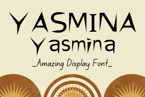
Some display fonts scream for attention. Yasmina just walks into the room and owns it quietly. There is a confidence to these letterforms that works across so many applications – I have been testing it on book cover concepts and branding mockups, and it delivers every time. It carries this modern edge without feeling trendy, which means it will still look good years from now.
Whether you are building a logo system or designing packaging that needs to stand its ground on a crowded shelf, Yasmina brings the presence without the drama. It is one of those fonts that makes your work look more expensive than it was.
Pull Yasmina into your library and let it stretch its legs on something bold.
The Mind Font
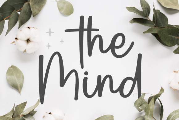
There is something about classic calligraphy that never loses its grip on me, and The Mind captures that timeless pull perfectly. The letterforms carry this harmonious rhythm that feels both intentional and effortless – like it was written with a pen that knew exactly where it was going.
I have been testing it on romantic projects and editorial layouts, and those cursive connections create such a satisfying flow across the page. And the PUA encoding means you can actually access all those lovely swashes without jumping through hoops, which as any designer knows, is the difference between a font you use and a font you admire from afar.
Let The Mind bring some classic calligraphy energy to your next project.
Fifteen fonts, fifteen distinct personalities, and one shared truth – the right typeface transforms good design into something people remember. Whether you need playful, elegant, bold, or understated, this collection proves there is no shortage of beautiful creative fonts waiting to bring your vision to life.
Bookmark this list, experiment freely, and let these handcrafted letterforms do what they do best. Your next project deserves nothing less.