
Font aesthetic
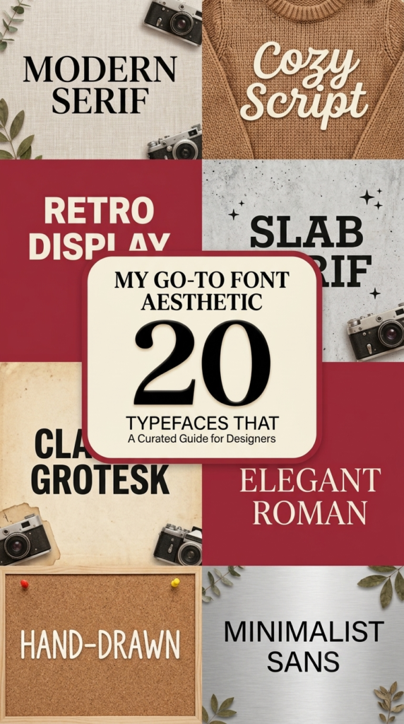
My go-to font aesthetic: 20 typefaces that never disappoint
That feeling when you spot a beautifully crafted letterform and just have to stop and stare? That’s the power of font aesthetic. It’s the secret sauce that turns a bland layout into something unforgettable.
Typography isn’t just a tool for reading; it’s the visual voice of your design, setting the mood and building trust in an instant.
In this post, I want to pull back the curtain on what makes typefaces truly captivating and show you how to wield this power in your own work.
Miscala Aesthetic Font
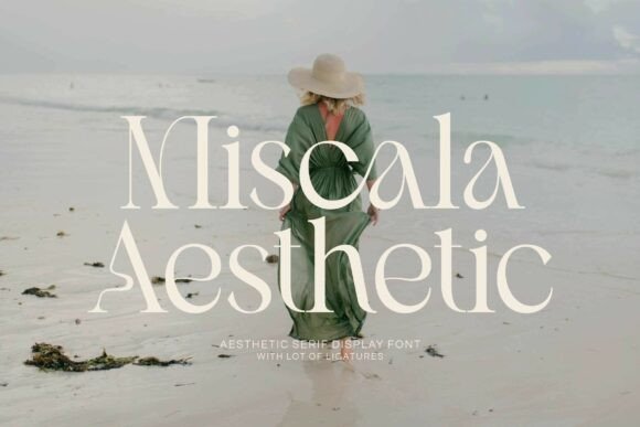
Let’s talk about a typeface that embodies this philosophy perfectly. The Miscala Aesthetic font is one of those rare word fonts that stops the scroll. It’s a refined serif that masterfully bridges the gap between timeless class and contemporary edge. Notice the pointed terminals and elongated serifs – they create that distinct high-fashion silhouette, making it an instant mood-setter for luxury branding, editorial layouts, or an elegant invitation suite.
If you are looking to infuse your projects with an upscale ambiance, having versatile options like Miscala in your library is a game-changer.
Ready to elevate your toolkit? Download the font set here.
Monstelo Font
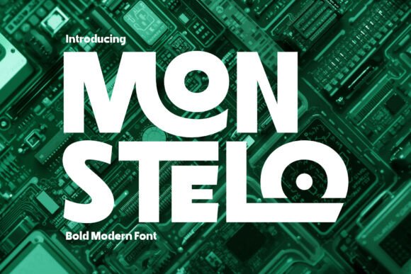
Sometimes your design needs to shout, not whisper. That’s where Monstelo steps in. This bold modern font brings serious futuristic energy with its geometric bones and smooth curves – think tech startups, digital art, and branding that demands attention. What I love about these word fonts is how they balance strength with flow; the letterforms feel intentional, never aggressive. Whether it’s a poster screaming for impact or a web header setting the tone, Monstelo delivers that confident edge.
If your project needs to look forward (not backward), this one belongs in your library.
Download the font set here.
Sunset Beauty Font

There is something magical about a script that feels like it was written just for you. Sunset Beauty captures that energy perfectly. This stylish script font moves with an organic flow – long, dramatic strokes dancing above and below the baseline like waves at golden hour. It has that personal, handwritten quality that makes word fonts feel less like typing and more like storytelling. I especially appreciate the PUA encoding, which gives you access to all those graceful ligatures without jumping through hoops.
For branding with heart, invitations that whisper romance, or beauty campaigns needing warmth, this one delivers effortless elegance.
Sometimes the best designs feel human. Download the font set here.
Coffee Aesthetic Font

Some fonts just feel like a warm hug. Coffee Aesthetic is exactly that – a sweet, cursive handwritten typeface that brings instant charm to any project. The gentle strokes feel personal and unfussy, like something you’d scribble in the margins of a favorite book or pen on a cafe napkin. What draws me to word fonts like this is their emotional honesty; they don’t try too hard, they just make you smile.
Whether you’re designing wedding signage, cozy branding, or a heartfelt Instagram story, this one adds that joyful, romantic touch without being overly precious.
Sometimes the simplest letterforms carry the most feeling.
Download the font set here.
Sandria Font
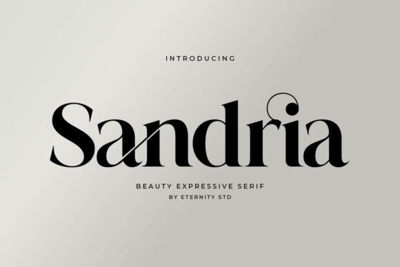
Every designer knows that feeling when a typeface just works – no fighting, no compromise. Sandria is that font. This elegant serif walks the line between timeless and fresh, with alternates and ligatures that create a rhythm across the page. The letters actually talk to each other, flowing in a way that feels intentional and refined.
What excites me about word fonts like this is the hidden depth; pop open that glyph palette (thank you, PUA encoding) and you’ll discover swashes and alternates that let you customize every word.
For logos that need distinction, editorial spreads craving polish, or branding that demands grace – Sandria delivers without ever screaming for attention.
Don’t miss out – download the font set here.
Nero Font
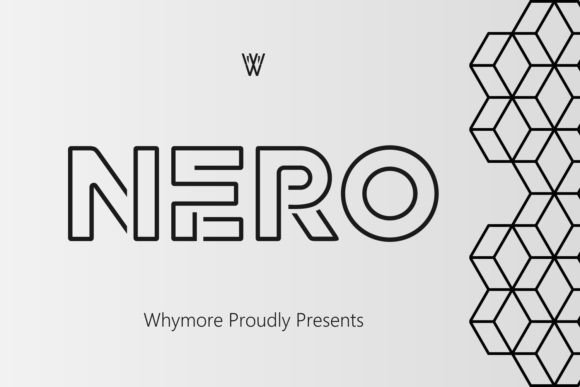
Let’s be real – finding a sans-serif that feels special is surprisingly difficult. Most blend together. Nero Sans Line Pro is the exception. This typeface brings that refined polish we all chase, with clean lines that somehow feel warm rather than clinical. It’s one of those word fonts that works just as beautifully on a billboard as it does on a business card, holding its personality whether printed or on screen.
What impresses me most is the versatility; it bends to your vision rather than forcing you to design around it. For corporate work needing sophistication or creative projects wanting that extra lift, Nero delivers quiet confidence.
Sometimes elegance speaks softly. Download the font set here.
Aesthetic Font
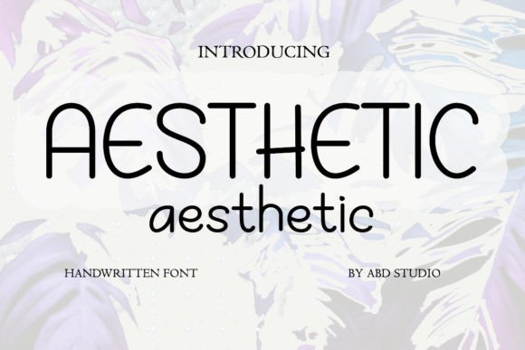
Not every font needs to be serious to be stunning. Aesthetic Font proves that point beautifully. This handwritten typeface brings pure joy to the page – friendly, approachable, and full of personality without trying too hard. I love keeping word fonts like this in my back pocket for projects that need to connect on a human level. It plays well with everything: packaging that wants to feel artisanal, social content craving authenticity, or kid-friendly branding that still looks considered. The magic is in how effortlessly it adapts.
Sometimes the best designs start with a font that simply makes you smile. Download the font set here.
Handwriting Font
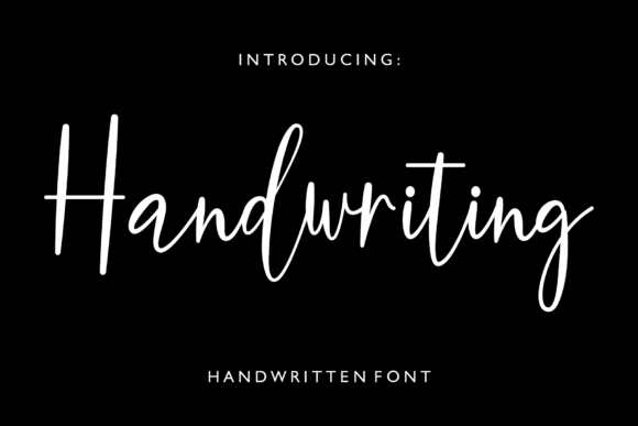
There is an art to making handwriting look effortless on screen. This Handwriting font nails it. Unlike scripts that sacrifice clarity for style, this one keeps every stroke legible while preserving that organic, human quality. The elongated verticals and graceful curves remind me of someone who takes their time with a fine-tip marker – intentional but never stiff.
What I appreciate about thoughtfully crafted word fonts like this is the quiet luxury they bring; they don’t shout for attention but still elevate everything around them. For lifestyle brands needing warmth, wedding suites wanting intimacy, or social content craving authenticity, this one bridges the gap between personal and polished.
Pair it with something clean and watch it sing. Download the font set here.
Heritage Font
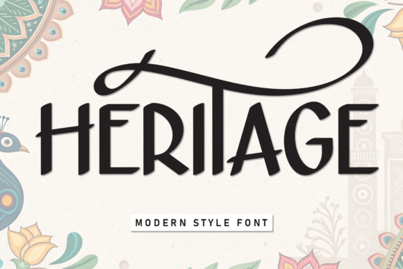
Some fonts carry stories within their shapes. Heritage is exactly that kind of typeface. With its elongated vertical strokes and that distinctive high crossbar on the “H,” it feels both ancient and entirely now – like something carved into stone but rendered for the digital age. I keep coming back to word fonts that offer this kind of personality; they do half the storytelling work for you.
Whether it’s branding for a cultural institution, packaging for artisanal goods, or travel campaigns that want to feel grounded, Heritage brings weight and meaning. The PUA encoding means all those special characters are ready when you need them.
Sometimes design needs roots. Download the font set here.
Casvatio Duo Font

Sometimes one font just isn’t enough. Casvatio Duo understands that. This set gives you two distinct personalities – a rugged sans serif with those beautifully rounded edges and a signature script that flows like actual handwriting. Together, they capture that mid-century adventure vibe, the kind you’d find on weathered signage or a craft brewery label.
What makes word fonts like this so useful is the built-in hierarchy; they literally tell you where to look. For artisanal packaging, cafe menus wanting warmth, or travel merch seeking authenticity, this duo delivers that handmade feel without looking precious.
The contrast does all the heavy lifting. Download the font set here.
Mikaila Signature Font
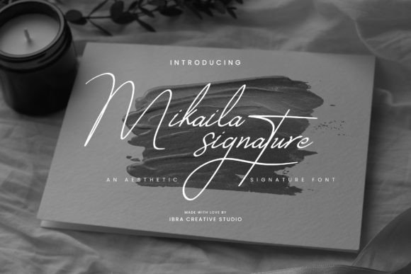
A signature says something about a person. Mikaila Signature says everything about your design. This typeface captures that intimate feeling of ink meeting paper – each letter flowing with the kind of deliberate grace you only get from someone who’s written their name a thousand times. The refined strokes and precise curves hit that sweet spot between delicate and confident. I’m always drawn to word fonts that feel personal without becoming fussy, and this one delivers.
For luxury invites that demand attention, branding that wants to whisper exclusivity, or packaging that needs to feel like a gift, Mikaila brings that signature touch.
Sometimes elegance is in the details. Download the font set here.
Coquette Ribbon Font
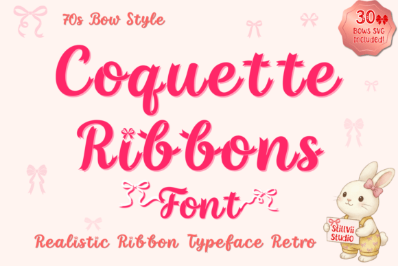
Okay, this one is genuinely unlike anything I’ve seen. Coquette Ribbon isn’t just a font – it’s literally satin woven into letterforms. The texture is ridiculous: actual folds, tiny slits, and layers that weave over and under like real ribbon dancing across the page. Word fonts usually stay flat, but this one pops right off the screen. That “old money” meets playful coquette energy is perfect for wedding suites, girlish apparel, or sticker shops wanting that handmade luxury feel. And the bonus?
hirty matching ribbon bows to play with. Quick heads-up for crafters: the delicate details mean this shines brightest for sublimation, printing, or digital use. Go big if you’re cutting vinyl.
Sometimes fonts become art. Download the font set here.
Chartist Font
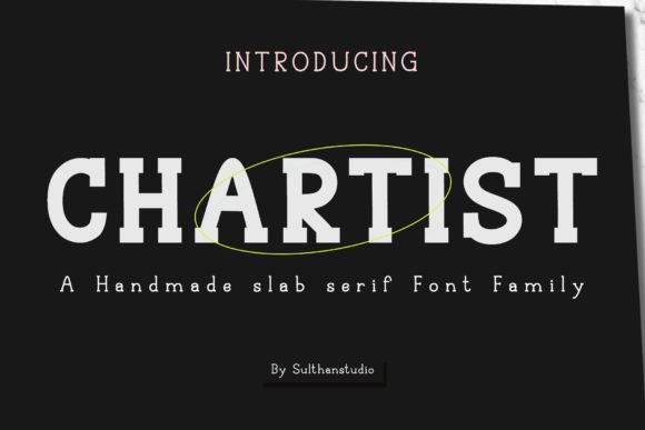
Some fonts give you one look and call it a day. Chartist hands you an entire toolbox. This handmade slab serif comes in sketch, regular, bold, and outline variants – meaning you can build texture and depth without ever leaving the typeface. I love stacking these versions together, letting the sketch outline sit behind the solid bold for that raw, dimensional feel. Word fonts this versatile make experimentation effortless; you can go from polished to playful in seconds.
For branding that needs character, packaging wanting authenticity, or editorial layouts craving something handmade, Chartist delivers that drawn-from-life energy.
Four personalities in one family means endless combinations. Download the font set here.
Aesthetic Font
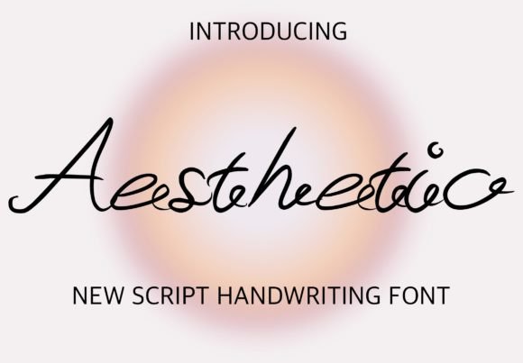
There is something comforting about a font that simply works everywhere. Aesthetic is that reliable friend in your type library. This lovely script brings warmth without demanding attention – delicate enough for wedding invites, bold enough for posters, friendly enough for social. I reach for word fonts like this when a project needs personality but still has to communicate clearly.
Holiday packaging, logo concepts, wall art, even T-shirts; it adapts to whatever you throw at it. The beauty is in that versatility; you don’t have to overthink it.
Sometimes the best designs start with a typeface that just feels right no matter where you place it.
Download the font set here.
Designart Font
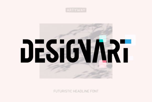
Look closely at DesignArt and you will see what happens when geometry meets imagination. Every letterform feels intentional, almost architectural – sleek lines that suggest movement and precision in equal measure. This is one of those word fonts that works overtime; logos feel sharper, headlines carry weight, and typographic compositions gain that extra layer of considered detail. I appreciate typefaces that don’t just fill space but actually shape how we perceive the message.
For projects needing that forward-looking energy, whether tech branding or creative portfolios, DesignArt delivers impact without ever feeling cold.
Sometimes the future of design is hiding in the shapes we choose. Download the font set here.
Perfect Minimalist Font
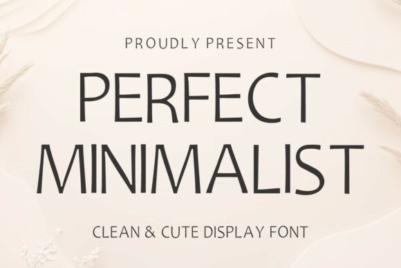
Here is the truth about minimalism – it is much harder than it looks. Perfect Minimalist makes it appear effortless. The slim letterforms and balanced spacing create that airy, refined quality that whispers sophistication instead of shouting for attention.
Word fonts like this earn their place in every serious designer’s toolkit because they never compete with the message; they simply elevate it. For branding that wants to feel established, editorial spreads craving breathing room, or wedding suites needing quiet elegance, this one delivers every time. Digital or print, it adapts without losing its character.
Sometimes the most powerful statement is the one you barely notice. Download the font set here.
Quality Font
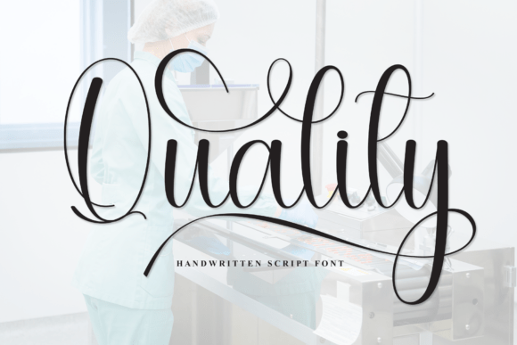
You know those fonts that feel like they arrived with their own lighting? Quality Font is exactly that. Handcrafted with a delicate sparkle on each letter, this one brings genuine magic to the page. I don’t use that word lightly – but when every keystroke adds a little shimmer, something shifts.
Word fonts like this remind me why I fell in love with design; they transform ordinary text into emotion. For wedding suites wanting that fairy-tale energy, greeting cards needing warmth, or projects begging for joy, Quality delivers wonder without sacrificing readability.
Sometimes a font isn’t just seen – it’s felt. Download the font set here.
Paris Hamilton Font
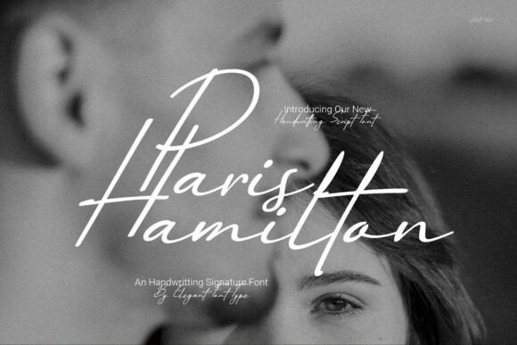
There is something quietly powerful about a signature done right. Paris Hamilton captures that energy beautifully. Every letter feels like it was drawn by hand with intention – natural strokes that carry personality without losing sophistication. I appreciate word fonts that move effortlessly between contexts, and this one delivers everywhere.
Album covers needing mood, boutiques wanting identity, food packaging craving warmth – it adapts without losing its soul. The Canva compatibility means you can work fast, but the craftsmanship ensures nothing looks rushed.
For designers seeking that sweet spot between polished and personal, Paris Hamilton brings genuine hand-drawn charm to every project.
Sometimes the best signature isn’t signed at all. Download the font set here.
Barakallah Font

Watch how Barakallah moves across the page and you will notice something rare – each letter seems to breathe. The high-contrast strokes create rhythm while those sweeping loops add drama without ever feeling forced. Word fonts like this understand that elegance lives in the details; the delicate connections between characters make everything feel intentional, almost ceremonial.
For luxury wedding suites needing that intimate energy, event branding wanting distinction, or editorial layouts craving a signature flourish, Barakallah delivers that personalized touch.
It reminds me that the best handwritten fonts don’t just look beautiful – they make you feel like someone took the time to write just for you.
Download the font set here.
Aesthetic Sunset Font
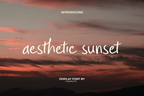
There are fonts that look like they taste like honey. Aesthetic Sunset is exactly that. Inspired by golden hour and summer nostalgia, this display typeface wraps your words in that warm, dreamy glow we chase all year. The smooth curves feel soft without losing structure – minimalist but never cold.
Word fonts like this earn their keep across every platform, from Instagram quotes begging for warmth to packaging wanting that serene energy. And the PUA encoding means every ligature and special character is right there when inspiration strikes.
Windows, Mac, Adobe, Canva – it plays nicely everywhere.
Sometimes a font is just a feeling waiting to happen. Download the font set here.
Typography is the heartbeat of design. Whether you lean toward rugged authenticity or quiet elegance, the right typeface transforms good work into something memorable. I hope this journey through font aesthetics inspires you to experiment, break rules, and trust your eye.
After all, we design not just to be seen, but to be felt. Keep creating.