
Good fonts
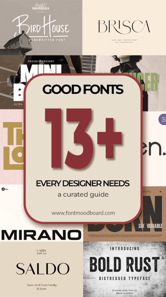
13+ Good fonts every designer needs: a curated guide to sans serif classics
Choosing the right typeface can make or break a design. As a professional graphic designer, I know that finding good fonts is about more than just aesthetics; it’s about communication and functionality.
In the vast world of typography, Sans Serif Fonts stand out for their clean lines and modern appeal. They offer unmatched readability across digital and print media, making them a staple in any designer’s toolkit.
In this post, we’ll explore why these versatile typefaces are essential for creating impactful and timeless work.
TRT Burn Font
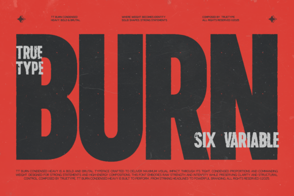
When a project calls for authority and efficiency, I immediately turn to Sans Serif Fonts that pack a punch. One of the standout good fonts in my current rotation is TRT Burn. This isn’t just another condensed typeface; it is a precision tool. Its compact architecture allows me to set bold, confident headlines that command attention without sprawling across the layout, which is a lifesaver when designing for mobile interfaces or crowded posters.
What I admire most is its dual nature. Up close, the refined geometry and balanced strokes project a clean, professional demeanor. Yet from a distance, its vertical proportions deliver that assertive visual impact. I’ve found it incredibly reliable for branding systems where the type needs to perform at ten different sizes, from a massive billboard down to a subtle UI label.
If you want to elevate your next project with this focused typographic voice, I highly recommend you get it on your system.
Salty Beach Font
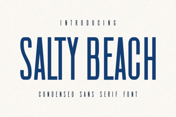
Sometimes you need a typeface that feels like a breath of ocean air — clean, refreshing, and effortlessly stylish. That is exactly the energy Salty Beach brings to the table. As a designer constantly searching for good fonts that bridge the gap between professional polish and creative fun, this one immediately caught my attention. It belongs to that special category of Sans Serif Fonts that manage to feel both minimal and full of personality at the same time.
The tall, narrow letterforms create a striking vertical rhythm that looks stunning on everything from film titles to indie coffee packaging. I recently used it for a beachwear brand identity, and the elegant spacing gave the logos a premium, sun-drenched vibe without trying too hard. It is equally at home on a cinematic poster as it is on a playful tote bag mockup. If you work with print-on-demand or love versatile branding tools, this font deserves a spot in your library.
Ready to add some coastal charm to your designs?
Limited Font
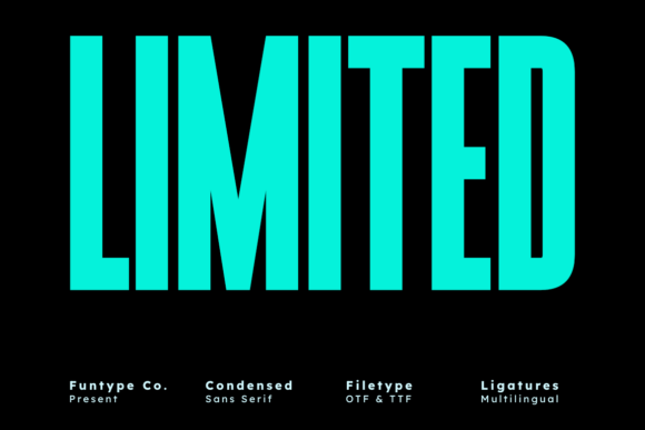
There are moments in design when subtlety takes a backseat, and you need something that simply yells confidence. That is where Limited becomes your secret weapon. In my years of hunting for good fonts that dominate a layout without clutter, this ultra-condensed powerhouse consistently delivers. It embodies everything I love about bold Sans Serif Fonts – the ability to command attention while maintaining immaculate cleanliness.
What sets Limited apart is its tall, commanding structure paired with that extreme compact width. It allows me to stack words tightly for album covers or sports graphics, creating visual tension that feels electric. The letterforms carry zero decorative fat – just pure, functional impact. I recently used it for an advertising campaign where every millimeter counted, and Limited filled the space with authority while keeping the message razor-sharp. If your project demands to be seen and remembered, this is your typeface.
Ready to make a bold statement with your next project?
Minimalist Font

Every designer needs a reliable workhorse in their toolkit – the kind of typeface that quietly elevates everything it touches. For me, that font is Minimalist. True to its name, this clean Sans Serif Fonts option proves that simplicity done right never goes unnoticed. When I browse through collections of good fonts, I always look for that perfect balance of neutrality and character, and Minimalist delivers exactly that.
Its unadorned letterforms create a blank canvas for creativity, adapting effortlessly to whatever project I throw at it. One week it is supporting a luxury brand identity with quiet elegance; the next it is grounding a busy editorial spread with calm readability. The beauty of Minimalist lies in its versatility – it never competes for attention but instead makes everything around it look better. For designers who believe that less is truly more, this typeface becomes an indispensable companion.
See how far simplicity can take your next project.
Brisca Font
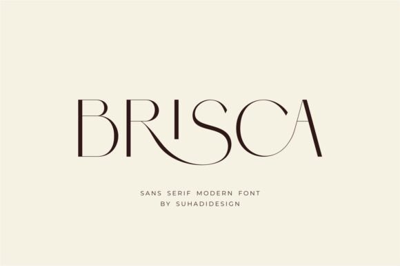
There is a certain magic that happens when a font just feels luxurious without trying too hard. Brisca captures that effortlessly. In the endless search for good fonts that bring elegance to branding, this modern Sans Serif Fonts option has quickly become my go-to for projects that demand sophistication.
What truly sets Brisca apart is the thoughtful ligature feature – those subtle connections between letters that transform ordinary text into something polished and intentional. It whispers class rather than shouting it. I have used it for cosmetics packaging where the typography needed to feel as smooth as the product itself, and for high-end magazine editorials where every detail matters. The letterforms carry a contemporary weight that feels current yet timeless, making it perfect for logos, business cards, or any project where first impressions count. If you want your work to exude quiet confidence, Brisca delivers every time.
Elevate your next brand project with a touch of class.
Bird House Font
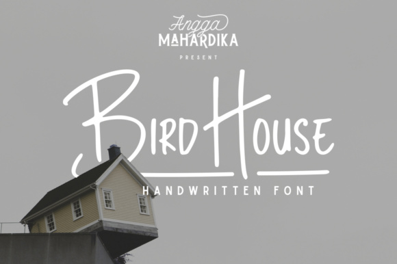
Sometimes a project needs to feel personal – like it was crafted by hand just for that moment. That is exactly the warmth Bird House brings to the table. While I spend most of my days working with precise geometric Sans Serif Fonts, I always keep a collection of good fonts that add a human touch, and this handwritten gem sits at the top of that list.
Created with actual markers, Bird House carries all the authentic imperfections that make lettering feel alive. The natural texture and fluid strokes bring a sense of authenticity that cold digital fonts simply cannot replicate. I recently used it for a small-batch coffee brand’s packaging, and those handcrafted letters communicated artisanal quality better than any polished typeface could. It is equally perfect for a creative signature logo or adding personality to social media graphics. When your design needs to feel approachable, genuine, and crafted with care, Bird House delivers that human connection instantly.
Give your next project a personal, handcrafted feel.
Influencer Font

There are typefaces that simply whisper, and then there are those that walk into the room and own it completely. Influencer belongs to the latter category. When my design demands authority, I reach for this bold condensed Sans Serif Fonts option – it is easily one of the most commanding good fonts in my library right now.
The geometric precision here is uncompromising. Every letterform stands tall and tight, occupying space with an almost architectural confidence. I recently used it for a tech conference keynote title, and the moment the audience saw those bold lines, the tone was set. It works wonders for editorial layouts that need to grab attention from across the room or album covers that demand to be noticed on crowded shelves. Influencer does not ask for attention – it takes it. If your project needs to communicate strength, authority, and modern edge, this typeface delivers without apology.
Ready to make your message impossible to ignore?
Gunken Font
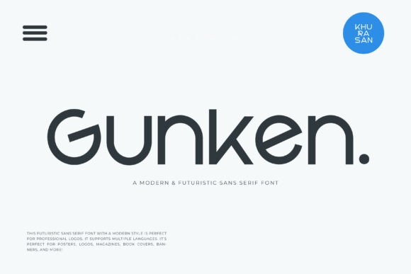
There is a certain beauty in typefaces that feel light – like they are floating just above the page. Gunken captures that ethereal quality perfectly. As someone constantly curating good fonts for futuristic projects, this sleek Sans Serif Fonts option has become my secret weapon for designs that need to feel forward-thinking without being cold.
The smooth, light execution creates an almost airy presence that works magic on tech branding and sci-fi book covers. I recently used it for a renewable energy startup’s identity, and those clean letterforms communicated innovation and approachability simultaneously. What surprises me most is its versatility – Gunken feels equally at home on a minimalist poster as it does on a glossy magazine spread. The letterforms carry a gentle sophistication that elevates everything from banners to logos without overwhelming the composition. For designers who believe the future should look beautiful, Gunken delivers that vision with quiet confidence.
Take your designs into the future with this sleek typeface.
Think Loved Font

Every once in a while, a typeface comes along that completely reimagines what bold typography can be. Think Loved is exactly that – a fearless experiment that paid off brilliantly. In my collection of good fonts, this geometric Sans Serif Fonts standout breaks all the rules while maintaining immaculate design discipline.
The magic lives in those playful circular cutouts and interlocking characters. They transform ordinary headlines into interactive graphic experiences that stop thumbs from scrolling. I recently used it for a streetwear drop where the brand name literally connected through the letterforms – it became a logo system rather than just a font. The ultra-heavy weight commands attention, but those unexpected negative spaces keep the eye exploring. For digital advertising competing in the attention economy or brands that refuse to blend in, Think Loved delivers that perfect balance of geometric strength and playful disruption. It proves that bold can also be clever.
Make your next headline impossible to scroll past.
Muffin Font
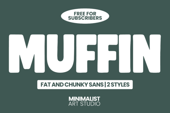
Let’s be honest – sometimes a design just needs to be fun. Not every project calls for serious minimalism or commanding authority. That is where MUFFIN enters the scene, and honestly, it has been putting a smile on my face since the first test print. Among the good fonts crossing my desk lately, this playful fat Sans Serif Fonts option proves that bold can also be friendly.
Those thick, chunky letters carry an irresistible charm while maintaining surprisingly clean geometry. The rounded edges soften the impact just enough to feel approachable, making it perfect for children’s product packaging or a retro-modern café identity. I love that it comes in two distinct styles – giving me flexibility while keeping visual consistency across a brand system. Despite its playful personality, MUFFIN remains highly legible even at smaller sizes, which is a rare feat for such generous letterforms. For designers who want their message to feel warm, memorable, and genuinely fun, this one delivers.
Grab MUFFIN exclusively free for subscribers and add some chunky charm to your next project.
Saldo Font

There is an underrated art to creating a typeface that simply disappears into the reading experience – guiding the eye without ever calling attention to itself. Saldo masters this beautifully. In my search for good fonts that balance professionalism with warmth, this sleek Sans Serif Fonts option has become my trusted companion for projects where clarity is king.
The clean, crisp lines create a reading experience that feels almost effortless. I recently used it for an annual report where dense financial information needed to feel approachable rather than overwhelming – Saldo delivered that delicate balance perfectly. Its minimalistic design carries a quiet sophistication that works just as well on a corporate website as it does on a luxury brand’s packaging. What I appreciate most is its timeless quality – contemporary enough to feel current, yet classic enough that it won’t feel dated next year. For designers who believe that true elegance lives in simplicity, Saldo proves that sometimes the most powerful statement is the one you barely notice.
Experience timeless elegance in your next project.
Bold Rust Font
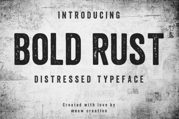
Sometimes perfection is overrated. There are projects that need to feel lived-in, weathered, and real – that is exactly when I reach for Bold Rust. While my library is full of pristine Sans Serif Fonts, this distressed gem proves that good fonts don’t always have to look brand new to make a lasting impression.
The bold characters carry that beautiful textured finish, as if they have survived decades of factory smoke and city grit. I recently used it for a craft brewery’s identity, and those worn edges communicated authenticity better than any polished typeface could. It is perfect for apparel graphics that need to feel like vintage band tees or signage that demands industrial character. Despite the rough texture, the letterforms maintain solid structure and readability. Bold Rust proves that strength and vintage soul can coexist beautifully – giving your work that handcrafted edge that audiences instinctively trust.
Give your next project some authentic grit and character.
Mirano Extended Font

Some typefaces carry stories within their curves – echoes of automotive legends and design history reimagined for today. Mirano Extended is exactly that kind of font. As someone obsessed with finding good fonts that balance heritage with modern utility, this extended Sans Serif Fonts family stopped me mid-scroll.
The reference point is unmistakable yet transformed. That iconic German off-road vehicle lettering lives here, but expanded into a complete typographic system that works across digital interfaces and bold headlines alike. Building on Aldo Novarese’s Eurostile logic, Mirano takes that engineered precision and gives it more breathing room – wider stance, sharper rhythm, cleaner finish. The range from Light to Bold, each with matching italics that maintain forward momentum, gives designers incredible flexibility. And the OpenType features? Ligatures, stylistic sets, positional numerals – total creative control baked right in. Mirano feels mechanical yet premium, confident yet refined. It is built for designers who want their work to move.
Experience the perfect fusion of heritage and modern design.
Mini Bold Font
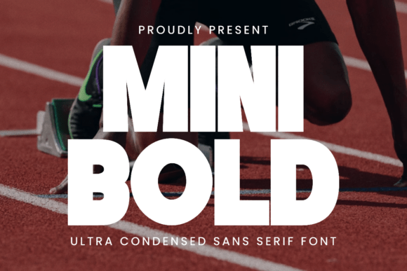
Every designer needs a typeface that delivers pure adrenaline. Mini Bold is precisely that – a shot of typographic energy that transforms ordinary layouts into high-voltage statements. Among the good fonts in my condensed collection, this powerful Sans Serif Fonts option earns its place by never backing down from a challenge.
The tall, bold letterforms carry an athletic confidence that feels made for motion. I recently used it for a esports team identity, and those compact characters captured the speed and intensity perfectly. It shines on sports graphics where every pixel needs to communicate power, or on posters demanding attention from across the street. Despite the extreme compression, Mini Bold never sacrifices clarity – each letter remains razor-sharp and unmistakable. For designers who believe typography should hit hard and leave a mark, this one delivers maximum impact with minimum width.
Fuel your next project with pure typographic energy.
Great typography is the invisible force that transforms good design into unforgettable visual communication. From bold condensed statements to elegant handwritten touches, the right typeface gives your work authentic voice and lasting impact. I hope this journey through my favorite Sans Serif Fonts has inspired your next creative project. Remember – the perfect font is waiting to bring your vision to life.