
Graffiti lettering fonts

15 Graffiti lettering fonts that capture the raw spirit of street art
The best typography lives somewhere between legibility and rebellion. We spend so much time perfecting curves in vector software that we forget letters can breathe, clash, and move.
Graffiti lettering never forgets that. It bypasses the rules of traditional type design and operates on instinct, rhythm, and raw energy. No kerning tables. No brand guidelines.
Just form pushed to its absolute limit. In this article, I want to break down what makes graffiti lettering such a powerful reference point for any designer looking to escape the safety of the grid.
Go Graffiti Font
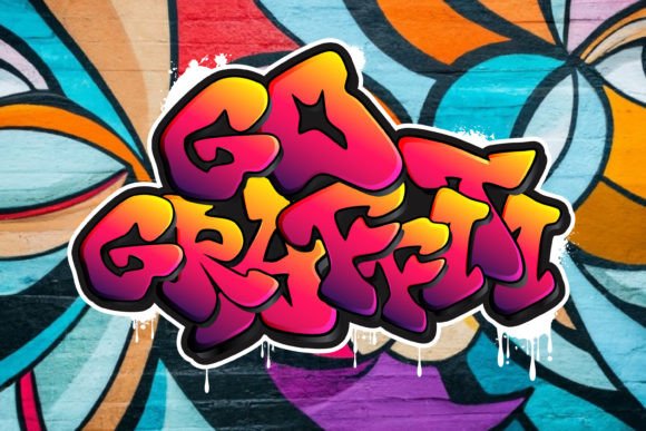
This raw approach to typography is exactly what drew me to Go Graffiti Font. It captures that unapologetic street energy without sacrificing usability. The letterforms carry the weight of spray paint and concrete, yet they hold up under the precision of digital design. Whether you are building a poster that needs to shout or a brand identity that demands attention, this typeface delivers the authenticity of graffiti lettering without the mess of actual walls.
It works for album covers, apparel, urban branding – any project that needs to feel alive. I have tested my share of display fonts that promise edge but deliver cliché. This one actually delivers.
Download Go Graffiti Font below and give your next project some real bite.
Graffikid Font
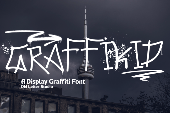
Sometimes you want the attitude of street art without the aggression. That is where Graffikid Font enters the frame. It takes the core elements of graffiti lettering – bold strokes, hand-drawn character, that unmistakable urban rhythm – and injects a sense of playful energy. The letterforms feel spontaneous, like they were sketched in a notebook before hitting the wall. I find myself reaching for this one when a project needs personality without taking itself too seriously.
Think streetwear drops, event flyers, or anything aimed at a younger crowd. It strikes that rare balance between legibility and raw expression. If your work could use a dose of unfiltered fun wrapped in authentic style, give this one a try.
Download Graffikid Font below and bring some real attitude to your next layout.
Blupsky Font

Some projects demand versatility without compromising attitude. Blupsky Font delivers exactly that. It sits at the intersection of bubble lettering, skate culture, and clean sans-serif structure – a combination that should not work but absolutely does. What I appreciate most is how it retains the visual punch of graffiti lettering while offering the flexibility of a full font family. The rounded forms feel approachable, almost playful, yet the overall composition holds its own in bold applications. This is the kind of typeface you turn to when you need street credibility without sacrificing readability.
It handles headlines, apparel graphics, and even body text with surprising ease. If your creative toolkit needs a reliable workhorse that still carries edge, this one belongs in your library.
Download Blupsky Font below and add some genuine urban versatility to your next project.
Nasty Habit Font

Not every typeface needs to behave. Some are meant to push boundaries and have a little fun. Nasty Habit Font is exactly that kind of project. It starts with the familiar rounded shapes of bubble lettering – roots firmly planted in graffiti lettering culture – but then it twists expectations. The eight variations let you shift from clean and friendly to something far more chaotic. One style drips like melted ice cream; another feels like it is about to burst. I appreciate how this range allows for real narrative play.
Whether you are designing a children’s book cover or a horror movie poster, the same font family adapts without losing its personality. The outlined version gives you that authentic hand-drawn feel, and the included drippy shapes open up even more creative possibilities. This is the kind of typeface that rewards experimentation.
Download Nasty Habit Font below and add some unpredictable energy to your next layout.
Bloochas Font
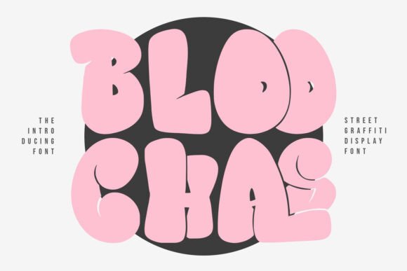
Sometimes subtlety is not the goal. You need something that commands attention without apology. Bloochas Font operates in that space. It strips graffiti lettering down to its raw essentials – strong strokes, unpolished edges, and a presence that refuses to blend into the background. This is the kind of typeface you reach for when a project demands immediate impact. I find it particularly effective for poster work, album art, or any layout where the text itself becomes the visual anchor.
There is no overcomplication here. Just bold, confident letterforms that carry the weight of street culture without trying too hard. It pairs well with minimalist layouts or stands alone when you want the message to hit hard. If your next project needs unfiltered attitude with zero clutter, this one delivers.
Download Bloochas Font below and make your work impossible to ignore.
Boy Graffiti Font
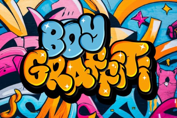
There is a fine line between borrowing from street culture and actually understanding its rhythm. Boy Graffiti Font lands on the right side of that line. It captures the raw, unpolished energy that makes graffiti lettering so compelling – no over-stylization, no unnecessary embellishments. Just honest forms that feel like they belong on a wall as much as they do on a screen. I have used this one for projects that need immediate visual impact without screaming for attention.
The letterforms carry confidence in their simplicity. Whether you are building a brand identity that leans into urban aesthetics or crafting a one-off poster that needs presence, this typeface holds its ground. It does not try to impress with complexity; it earns its place through authenticity. If you value type that speaks clearly and carries weight, add this to your rotation.
Download Boy Graffiti Font below and give your next design some genuine street credibility.
Hype Dope Font
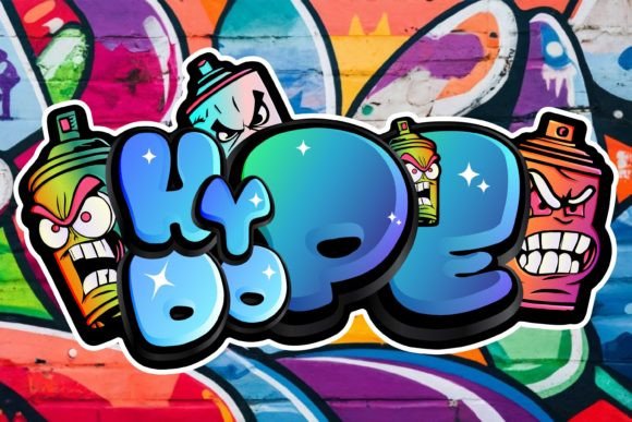
Some typefaces whisper. This one announces itself. Hype Dope Font leans fully into the gritty, unapologetic side of graffiti lettering – the kind of letterforms that feel like they were sketched under a bridge at midnight and somehow made their way onto your screen. What I appreciate here is the attention to detail beneath the raw exterior. The strokes carry weight, the edges hold texture, and the overall composition balances chaos with structure.
This is not a font for quiet layouts. It belongs on album covers, streetwear mockups, and any project where subtlety takes a back seat to presence. I have found it works especially well when layered with distressed textures or paired against clean backgrounds to let the letterforms breathe. If your creative direction calls for bold statements and zero apologies, this one fits.
Download Hype Dope Font below and inject some unfiltered energy into your next piece.
Giant Caps Font
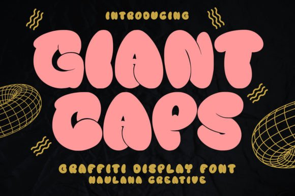
Scale matters. Some designs demand letterforms that refuse to be overlooked. Giant Caps Font delivers exactly that kind of presence. The exaggerated proportions and confident strokes capture the essence of graffiti lettering at its most unapologetic. This is the typeface you turn to when a project needs to command space – whether that is a mural-inspired poster, a streetwear logo, or any layout where subtlety is not an option.
What sets this one apart is the PUA encoding tucked beneath that bold exterior. It gives you effortless access to alternate glyphs and swashes, allowing for customization without wrestling with software limitations. I appreciate that level of flexibility in a display font. You get the raw street energy combined with practical design tools. If your work demands typography that carries weight and offers room to play, this one earns its place.
Download Giant Caps Font below and make your next project impossible to miss.
Graffiti Outline Font
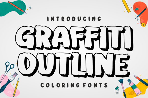
Some fonts give you a finished product. Others hand you the tools and step back. Graffiti Outline Font falls into the second category. It presents the structural foundation of graffiti lettering – thick outlines, built-in drop shadows, that unmistakable rugged texture – but leaves the color work entirely in your hands. I appreciate this approach because it treats typography as a starting point rather than a final destination.
The bold forms hold their own in black and white, but the real potential emerges when you start layering, filling, or applying your own palette. This is the kind of resource that rewards hands-on experimentation. Whether you are building custom apparel graphics, crafting hip-hop flyers, or developing streetwear branding that demands authenticity, the flexibility here makes a tangible difference. If you prefer creative control over presets, this one belongs in your toolkit.
Download Graffiti Outline Font below and make the color choices your own.
Street Writing Font

Versatility is not usually the first word that comes to mind with graffiti lettering. Most styles lock you into a specific mood. Street Writing Font breaks that expectation. It blends the energy of graffiti with the approachability of cartoon aesthetics, creating something that works across a surprisingly wide range of applications. The two-font setup – regular and extrude – gives you dimensional control without additional software tricks.
I find this particularly useful for logotype development, where depth can make or break a mark. The letterforms carry personality without sacrificing legibility, a balance that proves harder to achieve than it looks. Whether you are building a brand identity, laying out comic book dialogue, or crafting product packaging that needs to stand out on a crowded shelf, this one adapts without losing its character. If your projects demand flexibility paired with visual punch, give this a serious look.
Download Street Writing Font below and start experimenting with what it can do.
Drift Wood Font
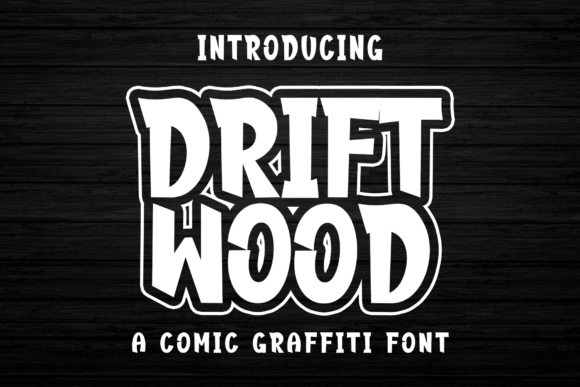
There is a specific sweet spot where playfulness meets street credibility. Drift Wood Font occupies that space comfortably. It takes the chunky, hand-drawn forms of comic lettering and infuses them with the attitude of graffiti lettering – resulting in something that feels both approachable and rebellious. I find myself reaching for this one when a project needs personality without sacrificing clarity. The thick strokes carry weight, the expressive shapes suggest motion, and the overall vibe lands somewhere between a graphic novel and a city wall.
Whether you are working on streetwear graphics, gaming covers, or even children’s book titles that need an edge, this typeface adapts without losing its identity. It does not try to be subtle, and that is exactly the point. Sometimes the work just needs to feel alive. If your next project calls for bold expression wrapped in genuine charm, this one delivers.
Download Drift Wood Font below and let your words do more than speak – let them move.
Scribble Moos Font
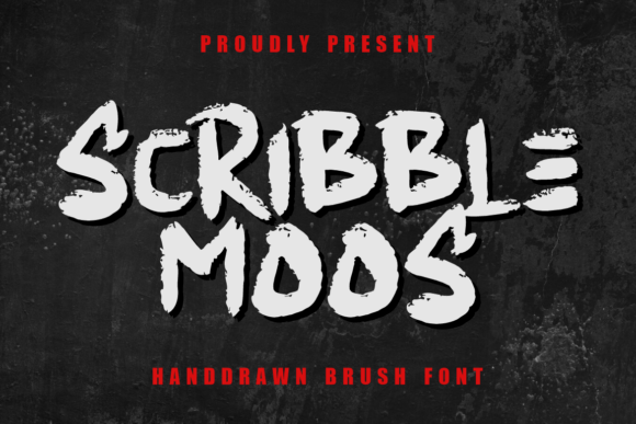
Precision and rebellion rarely share the same space. ScribbleMoos Font proves they can coexist. It brings together the raw energy of graffiti lettering with the clean structure of monoline brushwork – a combination that sounds contradictory until you see it in action. The rough, freestyle edges give each character a sketch-like authenticity, while the underlying consistency keeps the overall composition grounded.
I value this duality because it opens up more applications than a typical street-inspired typeface. It handles logo work with the same ease as packaging or editorial layouts. The hand-drawn quality adds warmth without sacrificing professionalism. Whether you are building a brand that speaks to a younger audience or crafting movie titles that demand personality, this one offers flexibility without dilution. If your creative process benefits from tools that bridge the gap between raw and refined, this font deserves a spot in your library.
Download ScribbleMoos Font below and bring some sketch-like authenticity into your next project.
Beat Mark Font

Some typefaces borrow from street culture. Others carry its pulse. Beat Mark Font falls into the latter category. The letterforms feel like they were pulled directly from a city wall – bold strokes, raw edges, that unmistakable rhythm that defines authentic graffiti lettering. What I appreciate here is how the design balances intensity with usability. It does not sacrifice readability for attitude.
Whether you are building a streetwear brand identity, crafting social media graphics that demand attention, or developing poster work that needs to resonate from a distance, this one holds its ground. The visual weight lands exactly where it should. It speaks the language of urban artistry without becoming a caricature of itself. If your projects require typography that carries genuine street energy rather than a sanitized version of it, this font delivers.
Download Beat Mark Font below and let your work echo with the rhythm of the unconventional.
Graffiti Crazy Smile Font
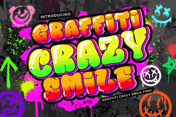
Not every project needs to take itself seriously. Sometimes the work benefits from a little personality that does not try to be intimidating. Graffiti Crazy Smile Font understands that balance. It pulls from the expressive freedom of graffiti lettering but channels it through a handwritten, almost playful lens. The result is something that feels authentic without being aggressive. I find this particularly useful for projects that need urban energy while staying accessible – think event flyers, sticker packs, or branding that leans into youth culture without forcing the edge.
The letterforms carry a grunge-inspired texture that adds visual interest, yet they remain legible across different applications. It works as comfortably on a birthday invitation as it does on street art-inspired posters. If your creative work calls for personality that feels genuine rather than manufactured, this one fits the brief.
Download Graffiti Crazy Smile Font below and add some expressive character to your next layout.
Hoopsy Font
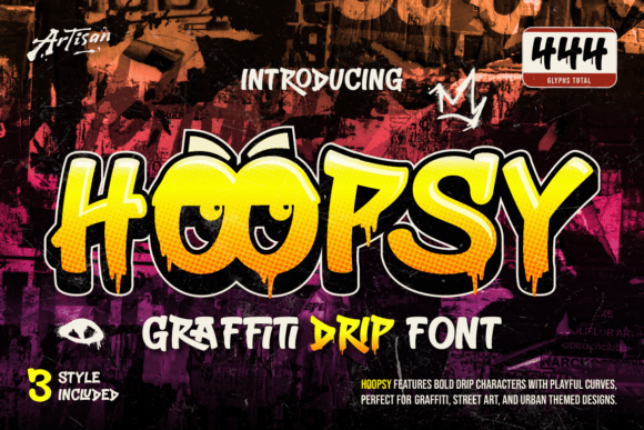
Some typefaces capture a moment. Others capture motion. Hoopsy Font leans into the latter with its signature drip details and thick, fluid letterforms. It takes the raw texture of spray-paint lettering and translates it into something that feels alive – like the ink is still settling on the surface. I appreciate how the design balances that rebellious energy with intentional structure. The playful curves keep it approachable, while the dripping elements ground it firmly in graffiti lettering culture. This one has become a go-to for projects that need immediate visual impact without feeling overworked.
Whether you are laying out skateboard graphics, crafting hip-hop visuals, or developing urban-themed branding that demands attention, the letterforms carry weight without becoming chaotic. If your work benefits from expressive typography that moves beyond static design, this font offers a solid foundation.
Download Hoopsy Font below and let your text leave a lasting impression.
The world of graffiti lettering offers more than just visual noise. It provides a vocabulary of movement, attitude, and authenticity that traditional typography often lacks. Each font in this collection brings something distinct – whether raw energy, playful charm, or structural flexibility. My hope is that these tools inspire you to push past safe design choices and embrace work with real personality. Find the ones that speak to your creative direction and put them to use.