Lettering fonts
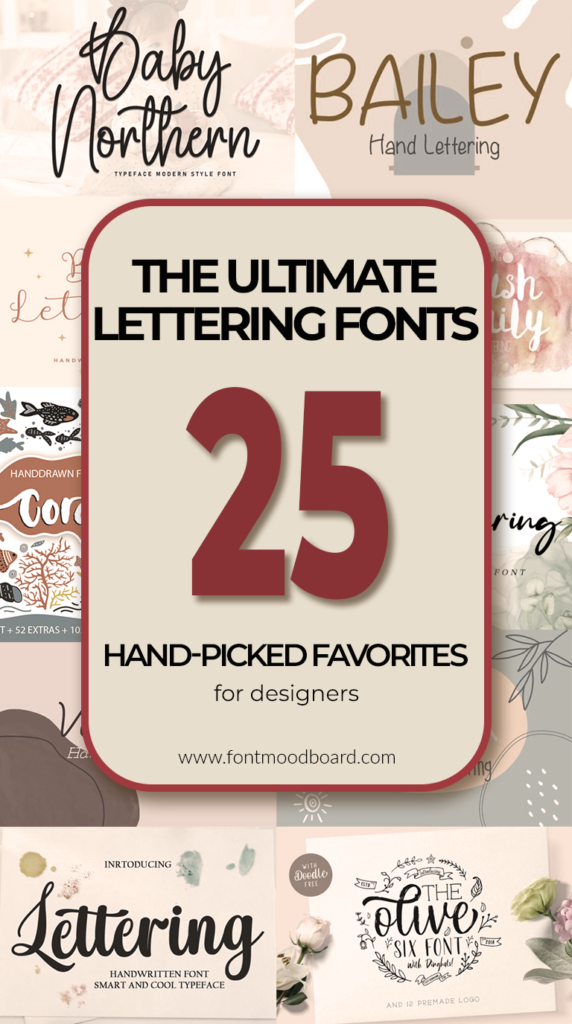
The ultimate lettering fonts collection: 25 hand-picked favorites for designers
Welcome back to the studio! Today, we are talking about one of my favorite tools for adding instant character to any layout: Lettering fonts. In the vast ocean of Creative Fonts, lettering styles hold a special place because they function almost like typographic illustrations. They capture the energy of hand-drawn letterforms while providing the practicality of a digital typeface.
Whether you are working on a rustic brand identity or a chic editorial spread, the right script or sans-serif lettering font can elevate your work from good to unforgettable. In this guide, I’ll walk you through why these fonts are essential for modern branding and how to pair them effectively without overwhelming your design.
Let’s dive into the art of making letters look human again.
Lettering Font
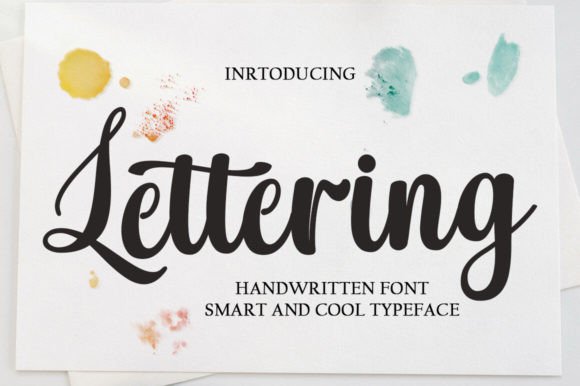
I recently got my hands on a typeface that perfectly embodies this balance between digital precision and human touch. It is called Lettering, and it instantly caught my attention. This is not just another casual script; it carries the soul of timeless classic calligraphy but presents it in a clean, contemporary package.
What I love about this particular set of Lettering fonts is the consistency. The shapes are flawless, yet the vibe remains completely relaxed and elegant. It is that rare mix that makes a font versatile enough for almost anything.
I immediately tested it on a mood board for a wedding invitation, and it sat perfectly next to delicate florals. Then, I threw it onto a bold product label concept, and it held its ground there too. Whether you are designing for wall displays, social media posts, or even just styling a photography watermark, this font brings that authentic handwritten taste without the hassle of drawing it yourself.
If you want to add a touch of quiet elegance to your next project, this is the one to try.
Bailey Font

Sometimes a project calls for something less serious and more playful. That is where Bailey steps in. This is a hand-lettering font with a genuinely cute personality, but don’t let that fool you – it works harder than you might expect. I threw it onto a mockup for a mug design just to test the waters, and suddenly I wanted to keep the mug for myself. Then I tried it on a pantry label layout, and it made organizing look good.
Bailey has that effortless charm that makes everyday items feel special. It is the kind of font that turns a simple business card into something people want to hold onto. Wedding invitations feel warmer with it. Social media posts stop the scroll without screaming for attention.
If you work with Cricut projects or find yourself designing stickers and planner prints regularly, you already know how rare it is to find a font that feels this friendly yet remains perfectly readable. It just works.
Bohemian Cassidy Font

Now let me introduce you to a font that feels like it already has a story to tell. Bohemian Cassidy. This is not your standard script. It has a lovely, flowing handwriting quality that immediately makes me think of signature design and branding work. When I first opened the glyphs, what caught my attention were the swashes. And because it is PUA encoded, you can actually reach them without jumping through hoops.
I started playing with it for a wedding concept, but then I took it somewhere unexpected. I paired it with a bold slab serif for a poster layout, and suddenly the whole composition had this interesting tension between flow and structure. It worked.
If you are working on logotypes or need a font that brings a charismatic impression to a brochure, this one deserves your time. Let it be the unexpected element in your next layout.
Skylar Font
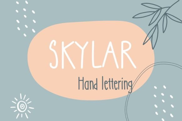
Every now and then I come across a font that makes me want to design things just for the fun of it. Skylar is exactly that. This one has a whimsical handwritten quality that feels refreshingly unpolished in the best way. Not messy, just free. I dropped it into a mockup for a greeting card and it looked like something you would actually want to receive in the mail. Then I tried it on a logo concept and realized it has more range than I initially gave it credit for.
Skylar has this ability to make everyday projects feel special. Pantry labels suddenly look like small pieces of art. Mugs become conversation starters. Planner prints actually make you want to open your calendar. If you work with Cricut or find yourself designing stickers and decor pieces regularly, you already know how hard it is to find a font that feels playful without looking childish.
This one walks that line perfectly. It simply makes people look twice.
Brush Family Font

Sometimes one font just isn’t enough. That is why the Brush Family caught my attention. This is actually three fonts in one package, plus some free watercolor elements. And they are designed to work together or stand alone. Let me break it down quickly because this matters.
Crispy brings that authentic hand drawn watercolor brush texture. Ah-Punch gives you a calligraphy-style script with alternates. Confetti rounds it out with a casual brush painted feel. I tested them layered together for a cafe concept and it looked like something you would actually frame on a wall.
The formats are clean. OTF and TTF for the fonts, plus PNG, EPS and AI for the elements. So you can jump right into Illustrator or Photoshop without friction.
If you are working on t-shirt layouts, posters, or even just designing a postcard for a friend, having this trio in your library gives you options. A small shop branding project. A pillow design. A wedding invitation. They cover a lot of ground.
Sometimes the best designs happen when you let fonts talk to each other.
Juliana Font
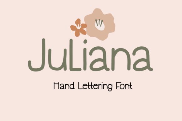
Some fonts whisper. Juliana is one of them. This is an elegant handwritten font with a delicate touch that immediately made me think of stationery design. The swashes are sweet without being overwhelming. They curve and flow naturally, adding personality without stealing focus from your actual message.
What impressed me is how well it holds up at smaller sizes. On a letterhead concept, it remained readable while still feeling special. In a title layout, the ligatures added that subtle texture we are always chasing.
And yes, it is PUA encoded. So all those graceful alternates are right there waiting for you. No complicated workarounds.
If you are working on anything that needs to feel personal and refined, give Juliana a try.
Valeria Font
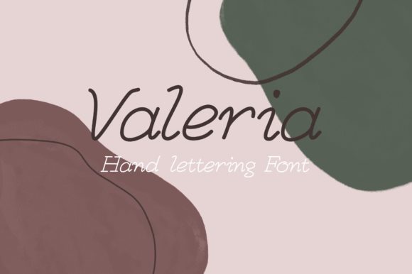
Let me introduce you to Valeria. This is one of those fonts that feels balanced right out of the gate. The characters flow nicely, each one holding its own weight without competing for attention. I tested it on a few different concepts just to see where it would break, but it never did. It just kept working.
What stands out to me is the delicacy of it. Not fragile, just refined. The kind of font that makes wedding stationery feel timeless or a personal brand look thoughtfully put together. And because it is PUA encoded, all those well-crafted glyphs and ligatures are easy to reach when you need them.
If you are looking for a handwritten font that brings elegance without trying too hard, this one deserves a spot in your library.
Blakey Font

Sometimes you need a font that steps back and lets the message breathe. Blakey is exactly that. This one is clean and simple in the best way. No distracting swashes, no unnecessary flourishes. Just neat handwritten characters that feel refreshingly honest. I dropped it into a few layouts and immediately noticed how easy it was to read. That matters more than we sometimes admit.
But here is the thing. Simple does not mean boring. There is a warmth to Blakey that makes it feel approachable. Like something you would actually use for a personal note or a small business sign. It has that rare quality of being both professional and friendly at the same time.
If you are working on projects that need clarity with personality, this font is worth a look.
Spring Funny Font
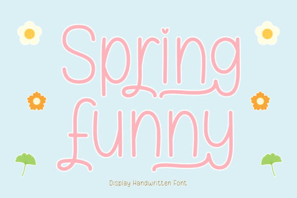
Spring Funny surprised me. The name made me expect something playful, and it delivers that. But what I did not expect was how much range it actually has. This is a monoline font with a minimalist feel, which means it fits into places you might not immediately think of.
I tested it on a magazine layout and it held its own. Then I tried it on some fashion apparel mockups and it looked surprisingly current. The clean lines give it a sophistication that works across seasons. Summer projects, autumn designs, even winter holiday stuff. It adapts.
If you work with Cricut or sublimation projects regularly, you already know how hard it is to find fonts that feel trendy without screaming for attention. Spring Funny strikes that balance. Logos, book layouts, craft projects. It just works.
Sometimes the most versatile fonts are the ones hiding behind unexpected names.
Baby Northern Font
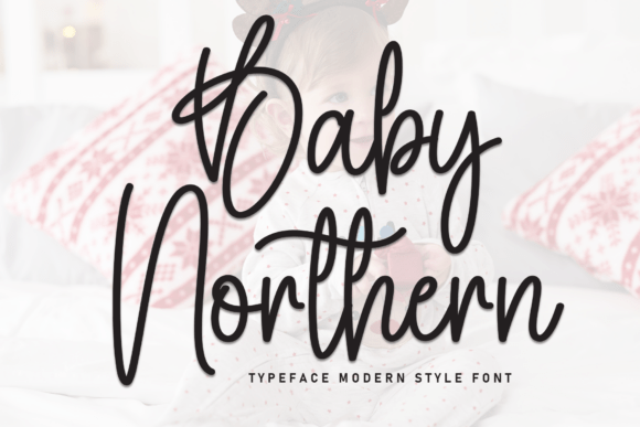
Baby Northern has a presence that is hard to ignore. The letterforms are tall and confident, with a slightly playful bounce that keeps things interesting. But what caught my attention is the dynamic baseline. It moves. Not in a chaotic way, just enough to feel human and alive.
I threw this onto a nursery print concept and immediately understood where it shines. It has that warm, modern quality that young parents are drawn to right now. Baby apparel, holiday greetings, little announcements. It fits those spaces naturally. But here is the thing. I tested it on some other projects just to see where it would break. A small café sign. A children’s book cover. It kept working.
Sometimes a font shows up for one job and ends being useful for five others.
Hasta La Vista Trio Font

Hasta La Vista is not really a font. It is more of a system. Three styles live in this package. Regular, Script, and Bold. And the idea is simple. You stack them, layer them, and let them talk to each other. I spent an afternoon just playing with different combinations and ended up with compositions that actually looked like hand lettered art.
The imperfect quality is what makes it work. Nothing feels mechanically perfect. The Script flows into the Bold weights naturally. The Regular holds everything down. T-shirt layouts came together fast. Wall art concepts looked finished without overworking them. Even just personal Instagram posts had more personality than usual.
If you build lettering pieces from scratch regularly, having these three ready to go saves time without sacrificing that handmade feel.
Hand Lettering Thin Font

Hand Lettering Thin is exactly what the name promises, but the execution surprised me. This is a script font rooted in actual handwriting, not just digitized perfection. The strokes are smooth and deliberate. It looks like someone sat down with a nice pen and wrote it out properly. That professional writing quality is hard to fake, but this one pulls it off.
I tested it on a beauty product concept and it made immediate sense. Skincare, cosmetics, anything that needs to feel elegant without being cold. It has a natural warmth that connects with women’s lifestyle branding effortlessly.
But here is where it gets interesting. Logotype work. Wedding stationery. Even packaging for smaller boutiques. The thin weight keeps things light and airy while remaining perfectly readable.
Sometimes the simplest approach is the one that works hardest.
Coral Waves Font
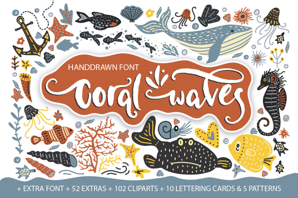
Coral Waves is the kind of font pack that keeps giving. At first glance, it is a friendly hand font with a carefree feel. Nothing complicated. Just warm and approachable. But then I looked at what actually comes in the download and realized this is more of a creative toolkit than a simple typeface. Two fonts to start with. Then 102 clip art files on top of that. Plus 10 lettering cards, 52 extras, and 5 patterns. All of it ready to use.
I threw together a quick concept for a summer brand and had something presentable in minutes. The stylistic alternates kept things from looking repetitive. The extras filled out the layout naturally. If you work on projects that need that handmade, coastal vibe, having all these elements ready saves serious time. Invitations, social posts, packaging details. It is all there.
Sometimes the best tools are the ones that show up with options.
Olive Family Font
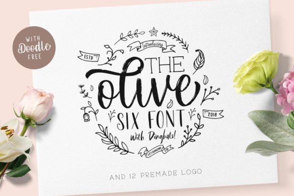
Olive caught my attention the moment I opened it. Six distinct fonts live in this family, each with its own personality but all sharing that same sweet and charming quality. I started testing combinations and quickly lost track of time. That is usually a good sign.
The romantic lettering runs through all of them. Some weights feel light and airy. Others have more presence. But they work together naturally, which is harder to pull off than most foundries realize. I tried them on wedding concepts first because that felt obvious. Then I pushed into branding work and packaging ideas. They kept delivering.
If you build projects that need layers of typography, having six fonts that actually belong together saves so much guesswork. You just pull from the family and let them talk to each other.
Sometimes the best discoveries happen when you let yourself play.
Lettering Font
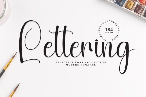
Some fonts work hard. This one just makes you feel good. Lettering has that hand-forged quality that is hard to describe until you see it on screen. The characters feel alive. Bubbly in the right places. Approachable without losing sophistication. I dropped it into a wedding invitation concept and suddenly the whole layout felt warmer. Like it was inviting someone in rather than just announcing information.
Greeting cards come alive with it. Anything that needs a dash of genuine happiness benefits from what this font brings. What impressed me is how well it holds up across sizes. Big and bold for a headline. Smaller for supporting text. The personality stays intact either way.
If you are working on projects that need to connect with people on a human level, this one is worth your time.
Delight Lettering Font
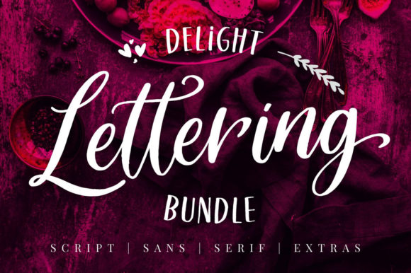
Delight Lettering showed up and I immediately started testing it on everything. This is a bundle built around casual hand lettering with a modern calligraphy style. The brush strokes feel natural, not stiff. The weight shifts where you expect them to. It just moves like real lettering.
I threw it onto a cosmetic concept first because the description mentioned it. Made sense. Clean, modern, approachable. Then I tried it on some quote layouts and suddenly could not stop. Greeting cards. Fancy labels. Random printed stuff just to see how it held up. It kept working. If you build brands that need to feel casual but intentional, or you find yourself designing posters that need warmth, this bundle gives you room to explore.
Sometimes the best fonts are the ones that make you want to keep designing.
Lettering Box Font
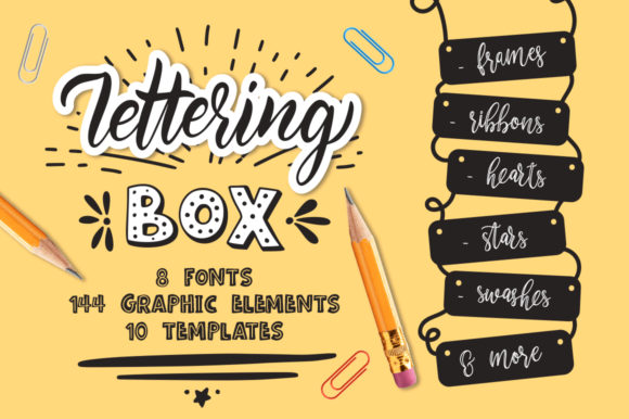
Lettering Box is exactly what you want when a project needs personality fast. This is a bold font family that does not take itself too seriously. The characters have a playful weight to them. Chunky in the right places. Fun without feeling childish. I tested it on some packaging concepts and it immediately made the products look more interesting.
But here is where it gets good. The extras. There is a whole set waiting to be explored. Swashes, alternates, little decorative touches that turn a simple headline into something with actual charm. I tried it on a poster layout and kept finding new combinations. The bold weights anchor everything. The playful details keep eyes moving around the composition.
If you work on projects that need to stand out while staying friendly, this family gives you options.
Winter Lettering Font

Winter Lettering surprised me by how well it moves between worlds. This is an upscale calligraphy font with flowing cursive lines that feel grand without being fussy. I expected it to shine on wedding invitations and formal pieces. It does. But then I tested it on a farmhouse sign concept and something clicked.
The rustic charm of a weathered board paired with these elegant strokes creates a tension that actually works. Sophisticated meets worn-in. Refined but approachable. Mugs looked better with it. T-shirt layouts had more presence. Even simple quotes felt like finished art.
Sometimes a font finds its way into projects you did not plan for and makes them better anyway.
Lettering Font
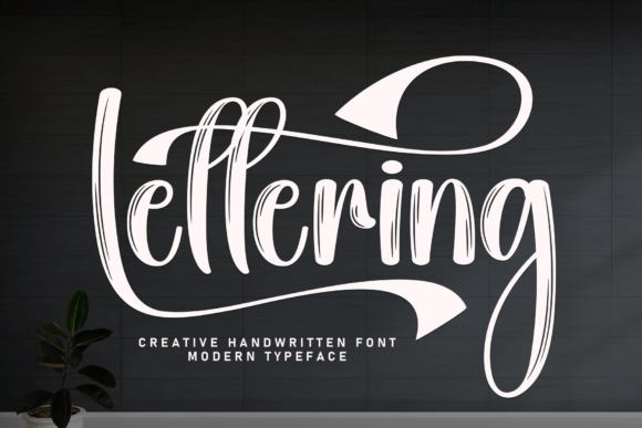
This Lettering font means business. It is bold and handwritten, but not in a soft or delicate way. The strokes carry weight. The presence is strong. I dropped it into a logotype concept and suddenly the whole mark felt more established. Like it had been around for decades but still looked current.
The confident energy is hard to miss. Headlines demand attention with this one. Product names stick in your memory. There is a nostalgic quality running through it, something that reminds me of vintage signage and old packaging, but the execution keeps it fresh.
If you work on projects that need to communicate strength without shouting, this font earns its place.
Quality Lettering Font

Quality Lettering delivers exactly what the name promises. The strokes are graceful without feeling fragile. The curves flow naturally, each one carefully considered. This is a handwritten script that brings genuine sophistication to anything it touches. I tested it on an editorial layout first and watched how it elevated the whole spread. Then I moved to branding work. Invitations. Even some packaging concepts.
It kept delivering that refined aesthetic without ever trying too hard. What stands out to me is the craftsmanship. You can feel the attention in every character. Nothing rushed. Nothing accidental. Just thoughtful lettering that makes your work look more considered by association.
If your projects need to communicate elegance quietly, this one belongs in your library.
Lettering Font
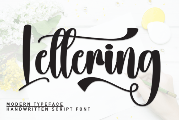
This Lettering font has a quiet confidence that grew on me the more I used it. The handwritten quality feels personal without being messy. Each character carries itself well, but the graceful swashes are what make it special. They do not scream for attention. They just add a subtle flair that makes the whole composition feel more considered.
I tested it on invitation concepts first because that felt right. It delivered that warm, inviting tone immediately. Then I pushed it into creative projects I had sitting around. Social graphics. Personal notes. Even some packaging ideas. The simple charm runs through everything. Not complicated. Just effective.
If you need a font that feels both elegant and approachable, this one earns the space.
Welcome to Lettering Font

Welcome to Lettering showed up and immediately found its way into my working files. This is a serif font with a neat and simple style that makes it dangerously useful. Elegant without being complicated. Distinct without demanding attention. I kept reaching for it across different projects and realized it was becoming exactly what the description promised. A go-to.
The technical side is clean too. OTF and TTF formats. PUA encoded so all the characters open right up in Illustrator, Photoshop, InDesign. Even Microsoft Word if that is your workflow. No extra software needed. Just install and work. I used it on a branding project first. Then an editorial layout. Then some random stationery just to see if it would break. It never did.
Sometimes the fonts that work hardest are the ones you do not have to think about.
Cute Lettering Font
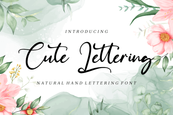
Cute Lettering does not try to be anything other than what it is, and that is exactly why it works. This is a handwritten font with a lovely timeless quality. Not trendy. Not trying too hard. Just warm and approachable in a way that connects immediately. I tested it on some logo concepts and watched how it made the marks feel more personal. Branding work came together faster. Quote layouts looked finished without much effort.
The swashes are what make it interesting. And because it is PUA encoded, they are right there when you need them. No digging. No complicated workarounds. Just open the glyph panel and pull what works.
If you build projects that need to feel friendly while still looking considered, this one deserves a spot in your rotation.
Hand Lettering Font
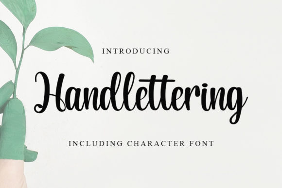
Hand Lettering arrived and I immediately understood why it felt familiar in the best way. This one draws from timeless classic calligraphy but presents it with a contemporary atmosphere. The form is impeccable. Well-balanced across every character. Nothing feels rushed or accidental. I tested it across a range of contexts just to see where it might struggle. It never did.
Editorial layouts welcomed it. Branding projects looked more considered. Even casual social graphics had more presence. The handwriting quality runs through everything, but it is refined enough to sit comfortably next to more structured typefaces. What impressed me most is how it holds its own at different sizes. Big and confident for headlines. Smaller and subtle for supporting text. The personality stays intact either way.
If you need a font that moves easily between projects without adjusting your approach, this one earns the investment.
Best Lettering Font

Best Lettering has a lightness to it that is hard to manufacture. The handwritten quality feels fresh and airy. Not heavy. Not weighed down by unnecessary details. I dropped it into a few concepts and immediately noticed how it brought a romantic feel without being saccharine. That balance is harder to find than most people realize.
Wedding work came together naturally with this one. Quotes looked like something you would actually frame. Even branding projects that needed a softer touch found their footing faster. The swashes are worth mentioning. They add just enough interest without overwhelming the letters. And because it is PUA encoded, they are right there when you need them. No extra steps. Just pull and place.
If your projects need to feel light and connected to something human, this font delivers.
Twenty-five fonts. Twenty-five different personalities. Some bold and confident. Others quiet and elegant. A few just plain fun. What ties them all together is the human touch. The imperfections. The warmth that only hand lettering can bring to a project.
Keep this list handy. Bookmark it. Come back when a layout needs more than just another sterile typeface. These fonts have character, and they are ready to lend it to your work.